If someone has to explain to you how to use an app, then the app is not good enough. How user interface design determines whether you will use that app or never again?
I still remember the excitement in our office as we started sketching the first design of our future aviation safety software. Both my co-founder and I have background in software development industry coupled with the experience in the aviation industry. Therefore, we have tasted the interaction between the two industries. They are similar, yet so different industries. Similarities lie in the need of both industries to follow guidance, rules and patterns. Also there is a lot of safety involved (for example, unit testing in the software development). On the other hand, the distinction in the domains of both industries, the mindset and technical skills of the end-users are substantially different.
Now, to successfully merge these two industries is a really formidable hurdle.
Aviation is such a complex industry that for any software to blend in nicely has to go through a bumpy road called “learning the user experience”. Avoiding this road or taking shortcuts can lead to dysfunctional software that will not be used properly, will create confusion among its end-users or even worse can cause a company crisis that can be seen in Boeing example as its software caused tragic events involving two 737 Max aircraft.
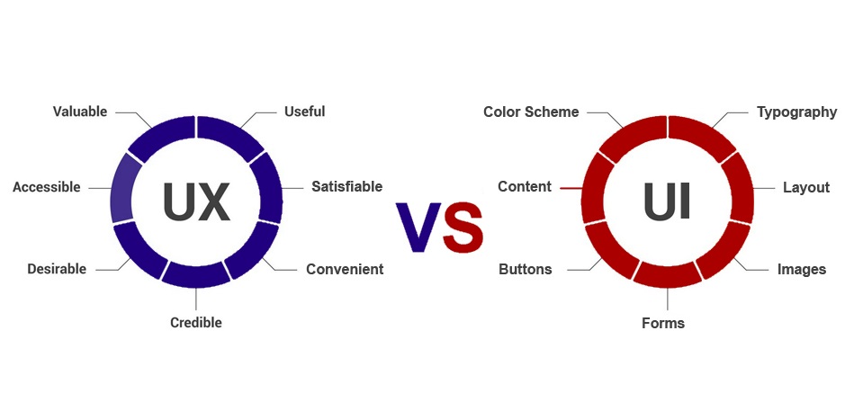
Back to our office, as we were brainstorming the look of the software app in our initial stages, we were touching the subject of UI or “User Interface”. User interface is a touchpoint between you as a user and the code behind the app. Everything what you see on your app screen including the buttons, labels or icons need to be skillfully designed and simulated to match the expected user behavior. The goal of well-designed interface is to provide end-user with this pleasant feel of simplicity and accomplishment. That “feeling” is the end product of what is called UX or “User Experience”. User experience encompasses all aspects of the end-user’s interaction with the product. In other words, the way and why you click, for example, certain button or navigate through the app determines your experience of that software. There is a lot of “risk assessments” involved in designing the software.

However most software at the beginning of their bumpy road to improving user experience fall into the trap of false-consensus effect. Basically, it is an effect where designers and developers often assume that the potential users of their product are like them, meaning that these end-users will understand and use exactly those features how designers and developers imagined. This is one of the leading causes of misunderstood software and users eventually not using it.
Aviation industry is unforgiving – if it’s not intuitive and value-oriented , no-one will use it. Learning this fast is crucial in developing software for aviation. After initial hurdles and mismatched design we changed the mindset and centered our development around our end-users. Quickly we gathered momentum and pivoted with the development. The aviation end-users don’t need yet another complicated app. Everyone in aviation is already overwhelmed with tons of information. It is essential for Aviation software designers to understand this major difference between the industries. App software needs to deliver value effortlessly. Achieving that puts tremendous pressure on the development team to deliver quality output both on UX and UI front. Often this goes unseen or undervalued by the end-user.

ICARUS mobile aviation safety app centers around it’s end users
Aviation safety is often neglected by its very own users as we have witnessed many times that users take safety for granted, including the software that is based on Aviation Safety. Luckily, we were able to get traction and analyze end-users behavior while listening to our customer requests, which resulted in simpler interface and software redesign for short attention spans of our users. It is true, aviation end-users, especially when it is about the safety, request information instantly and don’t have the desire to navigate throughout the app for too long. User interface has changed according to our findings – meaning our user experience has changed as well. Both are linked. With good, modern and intuitive user interface, user experience will improve as well as user engagement which can lead to better safety culture. This way we, as aviation software designers/developers, can contribute in improving aviation safety!


